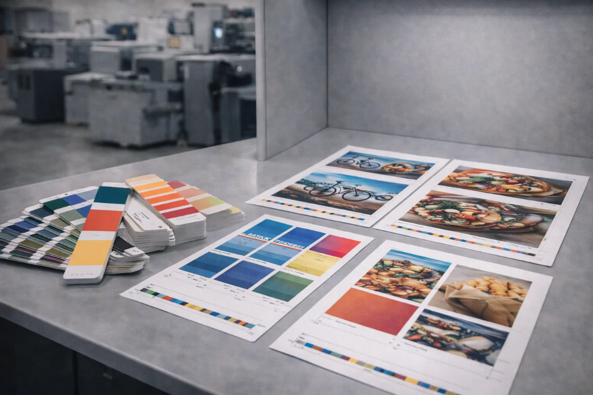
Understanding Colour Systems in Printing #
Commercial printing relies primarily on two colour systems: process colour (CMYK) and spot colours.
CMYK uses four inks layered in different proportions to reproduce a wide range of colours. Spot colours involve printing with a pre-mixed ink formulated to achieve a specific hue.
Choosing the right system affects colour accuracy, cost, production method, and artwork preparation.
What CMYK Printing Is #
CMYK stands for cyan, magenta, yellow, and black. By varying the percentage of each ink, printers reproduce images, gradients, and full-colour photographs.
CMYK is suitable for:
-
Photographic images
-
Full-colour illustrations
-
Marketing materials
-
Most standard print jobs
It is cost-effective because it uses the same four inks for all designs.
What Spot Colours Are #
Spot colours are specially mixed inks printed in addition to or instead of CMYK. They are often referenced using standardised colour libraries.
Spot colours are used when:
-
Brand colours must be consistent
-
Metallic or fluorescent inks are required
-
Specific hues cannot be matched reliably in CMYK
-
Simple designs use limited colours
They can appear richer and more consistent than process colours.
How Spot Colours Affect Cost #
Using spot colours usually increases cost because:
-
Extra ink stations are required
-
Press setup becomes more complex
-
Plates may increase
-
Make-ready time grows
-
Wash-ups between jobs are longer
Digital printing may simulate spot colours using CMYK rather than true additional inks, which can affect accuracy.
When to Use CMYK #
CMYK is usually appropriate when:
-
Designs contain photographs
-
Colour variation is acceptable within tolerance
-
Budgets are constrained
-
Quantities are small
-
Digital printing is planned
Most everyday marketing materials fall into this category.
When to Use Spot Colours #
Spot colours are preferable when:
-
Corporate identity colours are critical
-
Packaging requires consistency across runs
-
Metallic effects are needed
-
Fluorescent colours are specified
-
Large offset runs justify setup cost
These jobs often require RFQ workflows rather than instant pricing.
Artwork Setup Rules for Spot Colours #
When preparing spot colour files:
-
Name colours clearly in the swatch panel
-
Avoid duplicate swatches
-
Use vector objects where possible
-
Do not convert to CMYK accidentally
-
Separate special finishes into their own layers
-
Indicate varnish or coating layers clearly
Improper naming can cause inks to merge incorrectly during output.
Mixing CMYK and Spot Colours #
Some designs combine both systems. For example:
-
Photographs printed in CMYK
-
Logos printed in spot colours
-
Spot varnish layers for emphasis
These require careful separation and proofing.
Proofing Spot Colour Jobs #
Because spot colours are mixed physically, proofing is strongly recommended. Hard proofs or press proofs help confirm:
-
Hue accuracy
-
Density
-
Interaction with paper
-
Finishing effects
Soft proofs cannot fully represent metallic or fluorescent inks.
Digital vs Offset Considerations #
Digital presses typically simulate spot colours using CMYK or limited extra inks. Offset presses can print true spot inks but require more setup.
The production method influences whether spot colours are technically feasible.
Summary #
CMYK printing is versatile and economical for most jobs, while spot colours are used when precise hues, metallic finishes, or brand consistency are required.
Selecting the correct colour system early prevents surprises, avoids rework, and ensures predictable print results.
